Google UX Design Challenge for
Social Good

Challenge:
Create an app and responsive website for social good to complete Google UX certification program.
Solution:
I created an app and responsive website that would teach kids about empathy and emotions.
Research
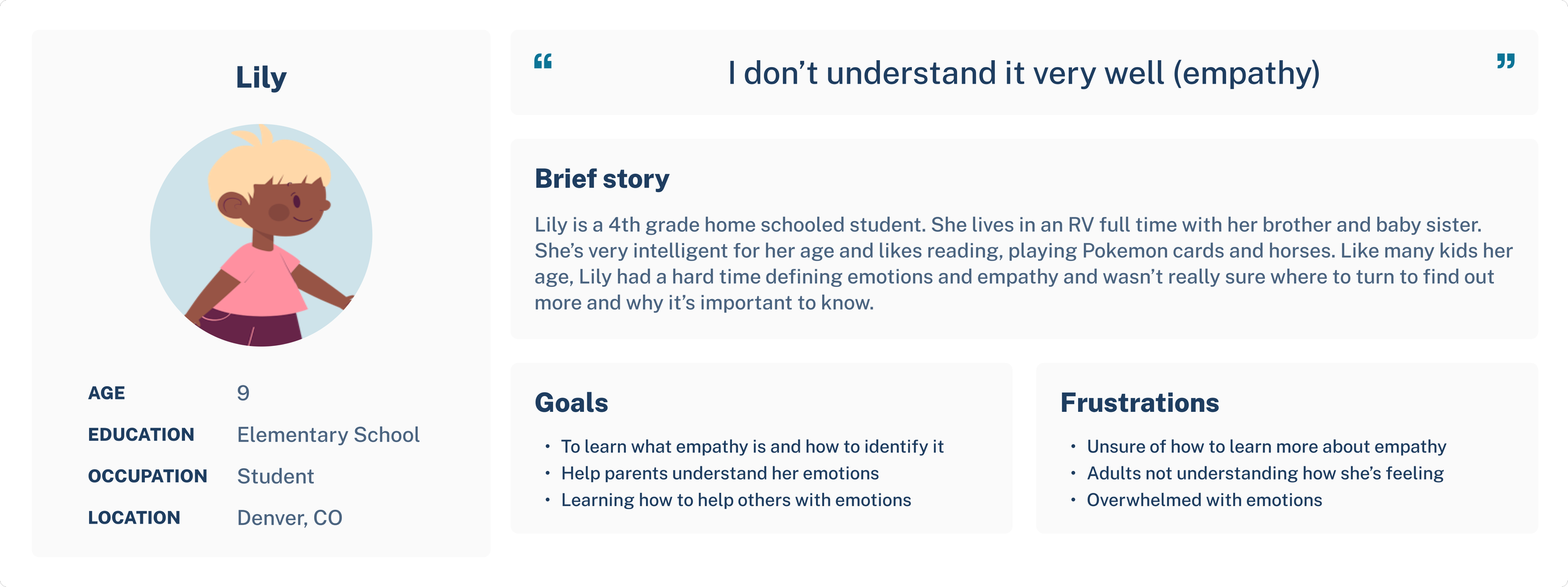
User Personas
To conduct my research and understand the user I relied on user surveys consisting of kids ages 7-12 years old, that both had siblings and were old children. They all expressed they were unclear what empathy was and were not all sure what emotions were or how to deal with them.
User Journies
“Teacher and explorer at heart.”
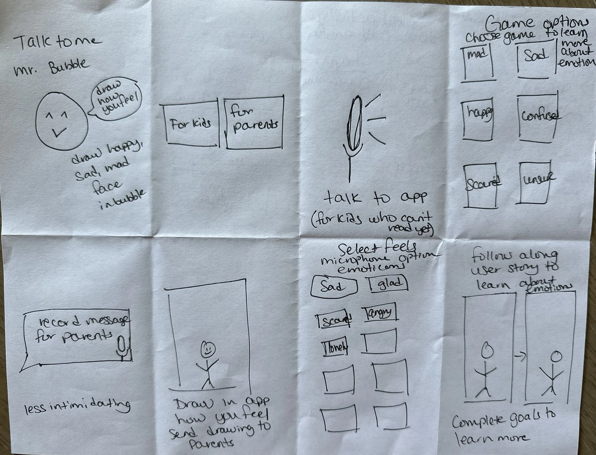
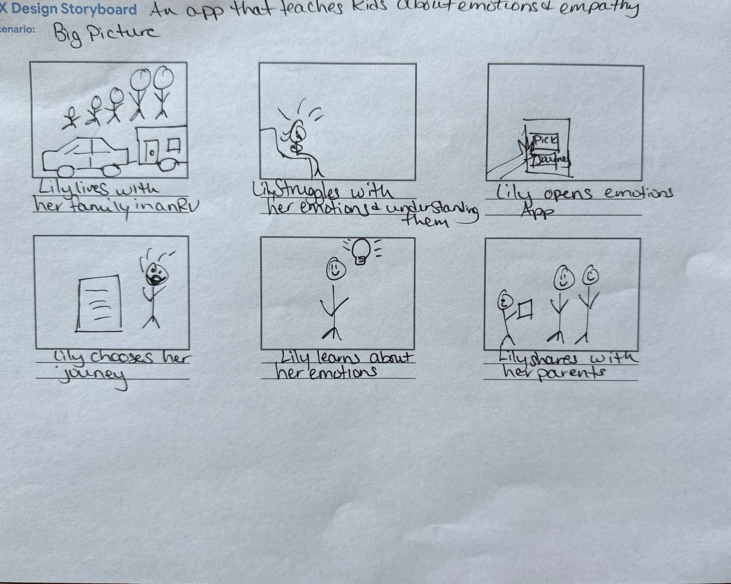
Crazy 8s & Storyboarding - Big Picture & Close Up
No idea was off limits when it came to the Crazy 8s exercise. Even the most unrealistic idea can be refined into a great idea. From there I went on to the big picture and close up to really determine what the users need and want.
Site Map
I created a sitemap with the user in mind, keeping the user flow simple and easy to follow especially since it will be for kids
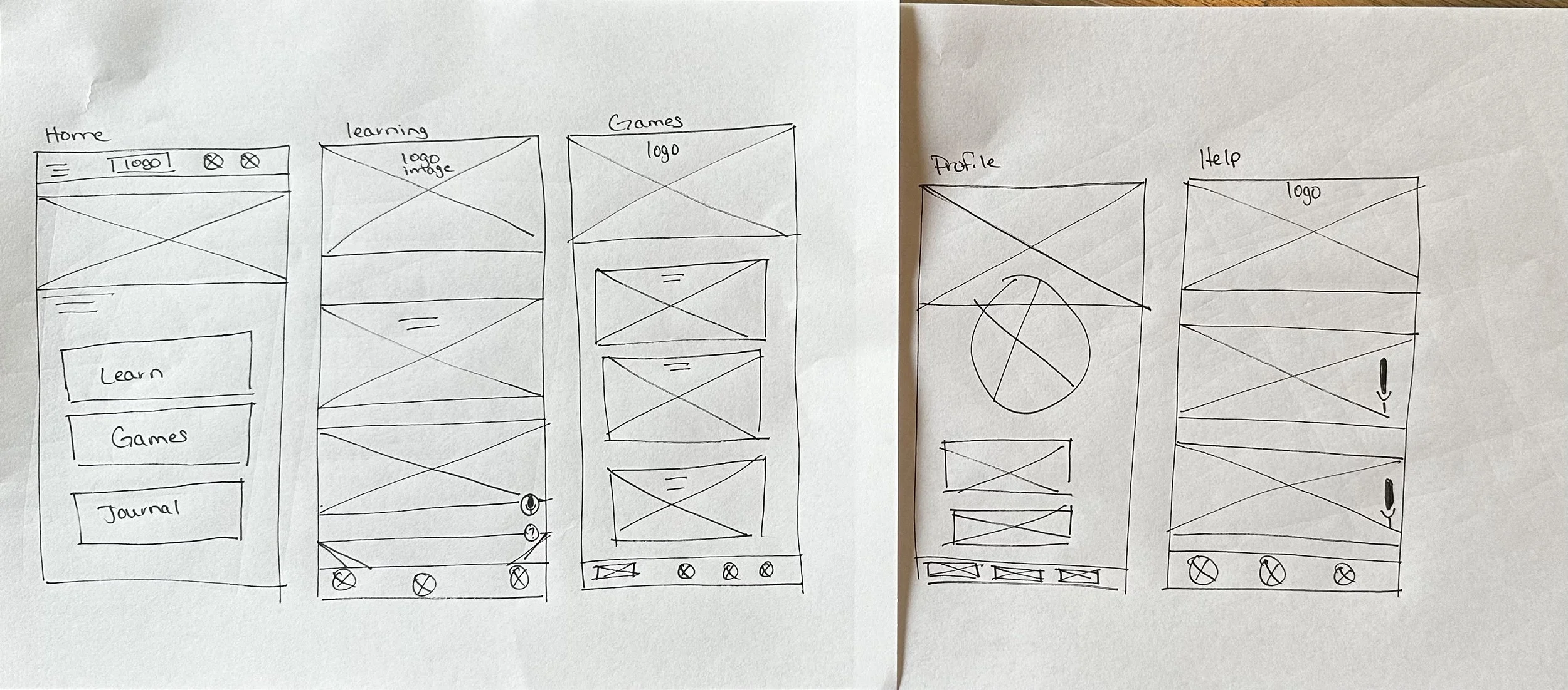
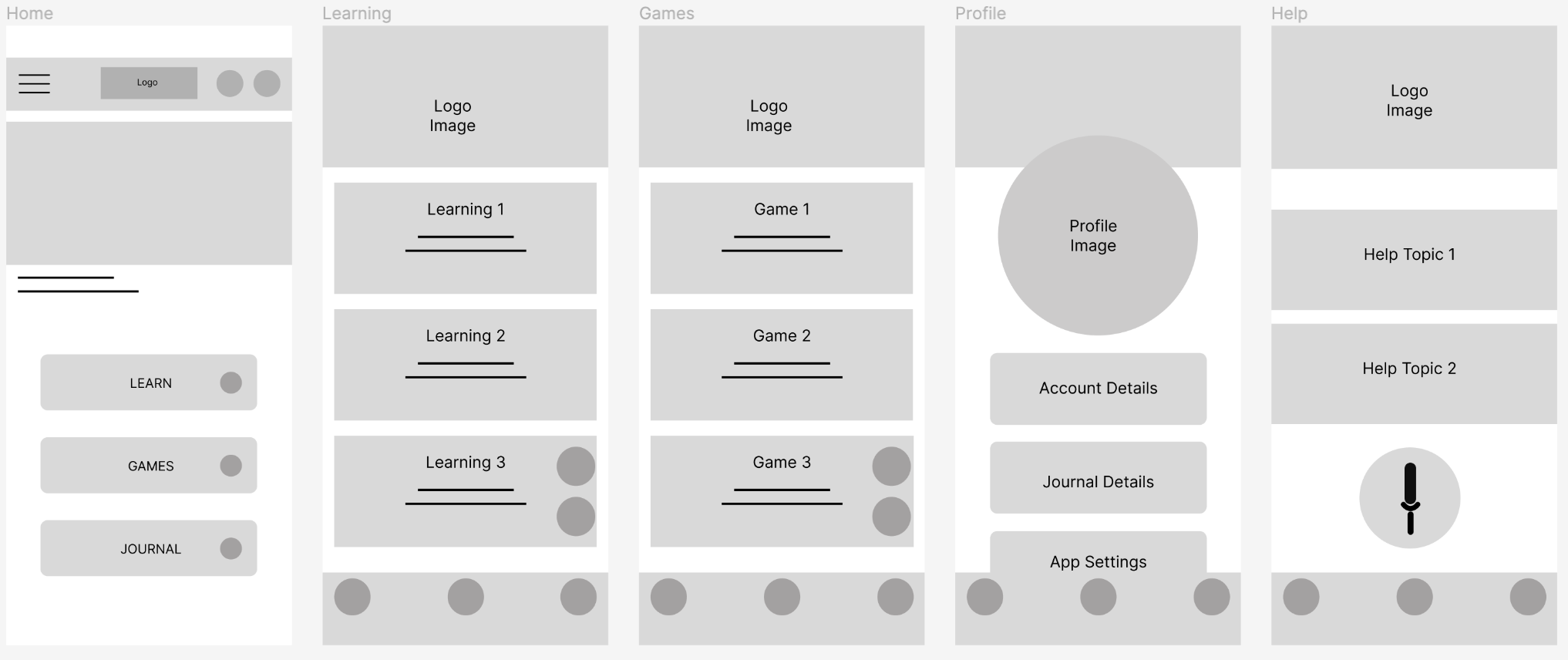
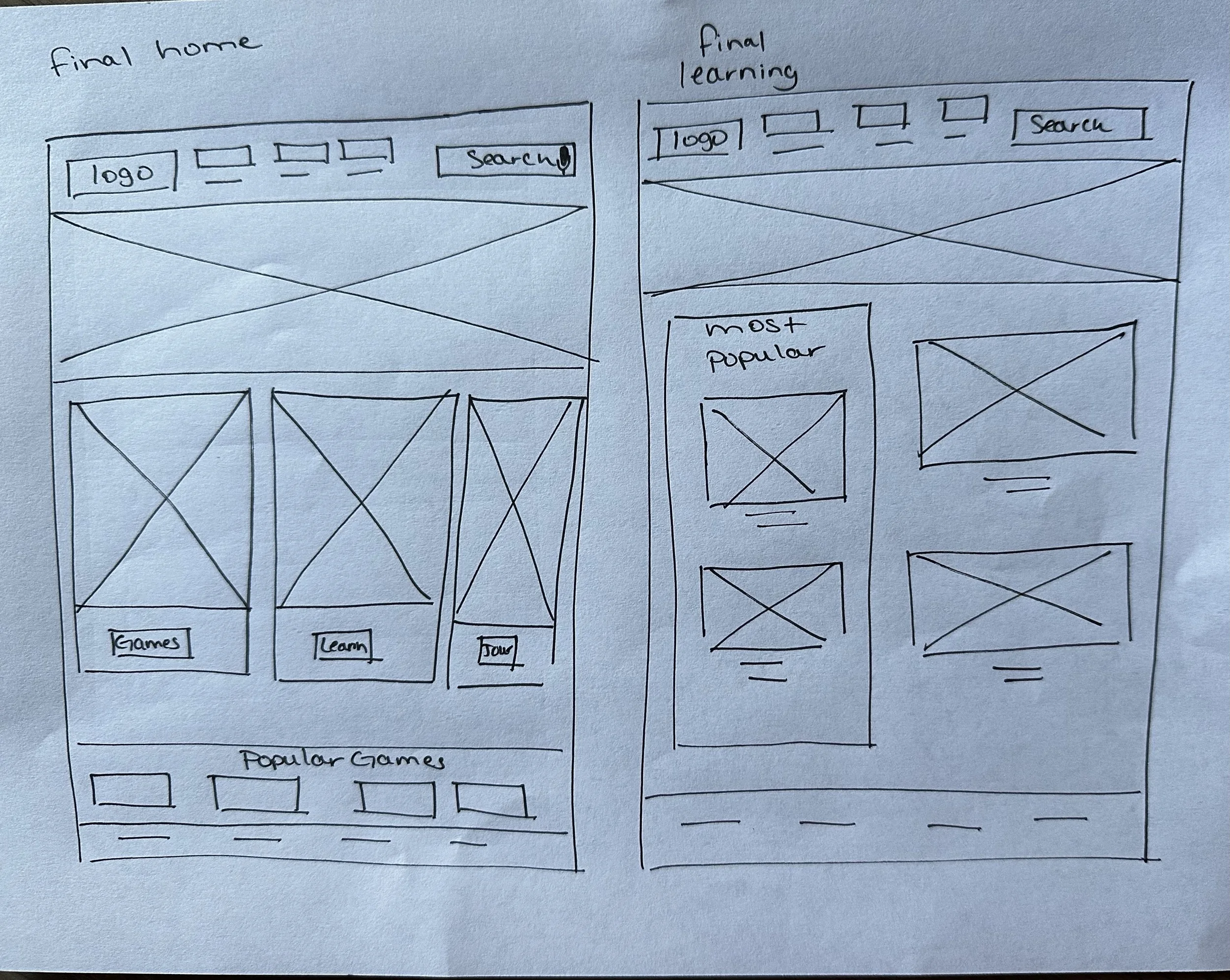
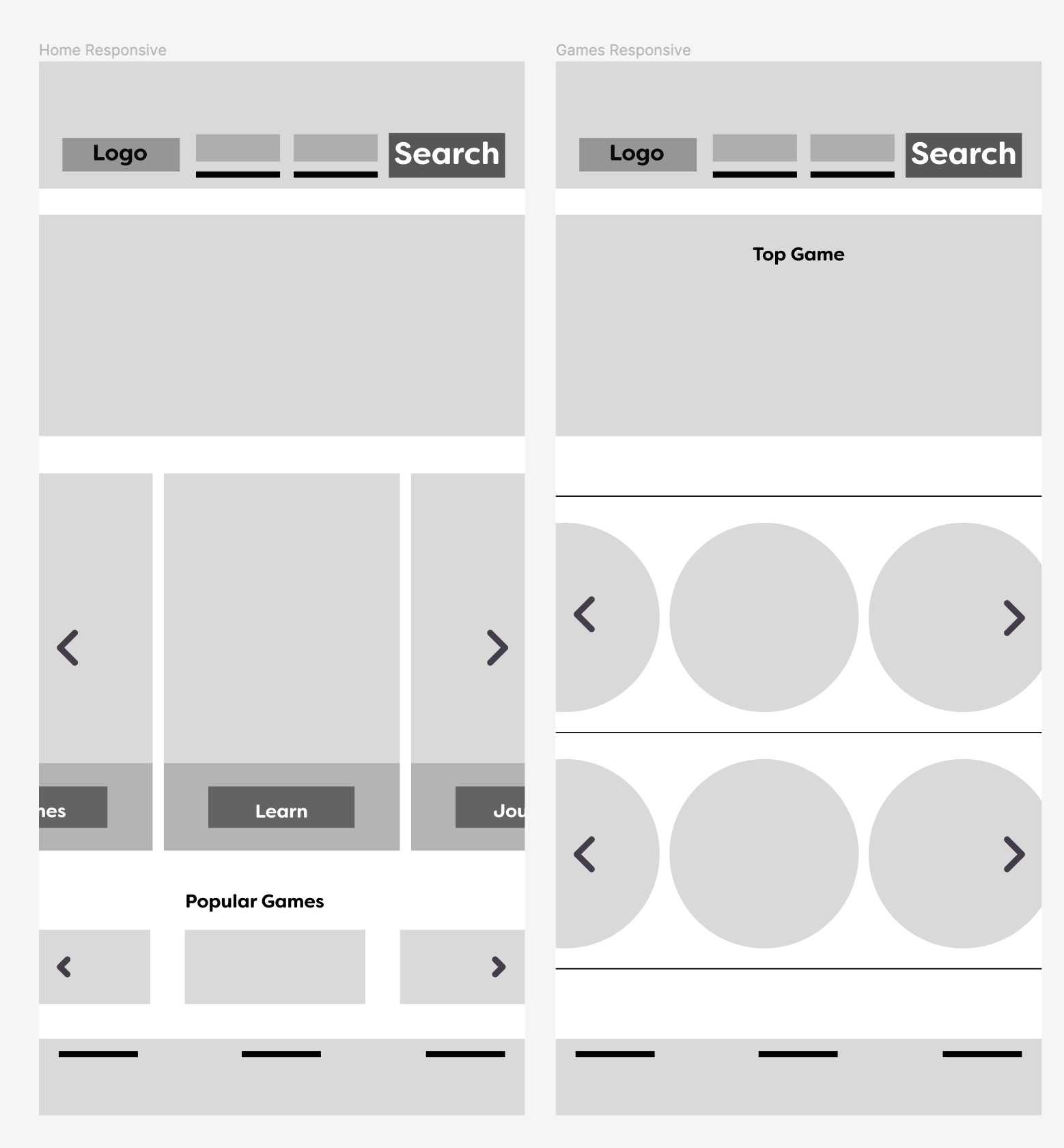
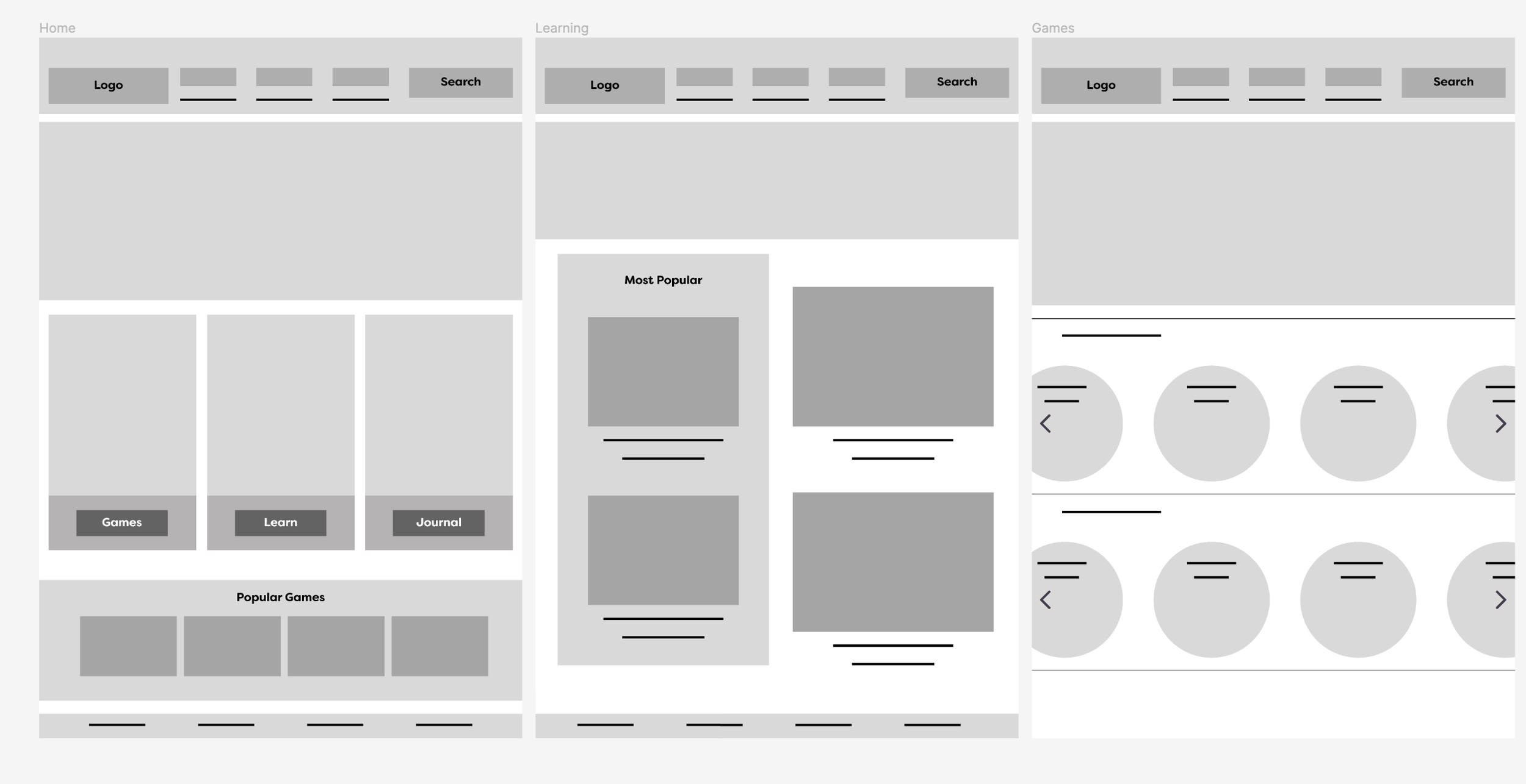
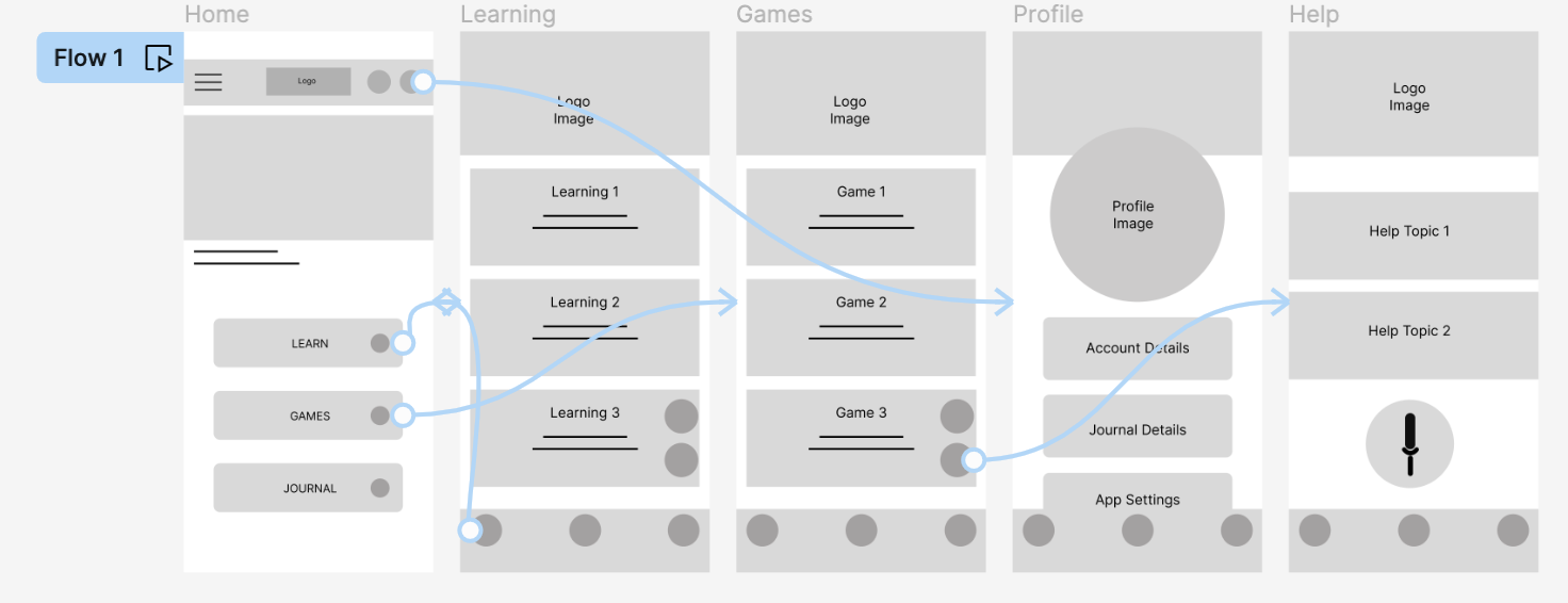
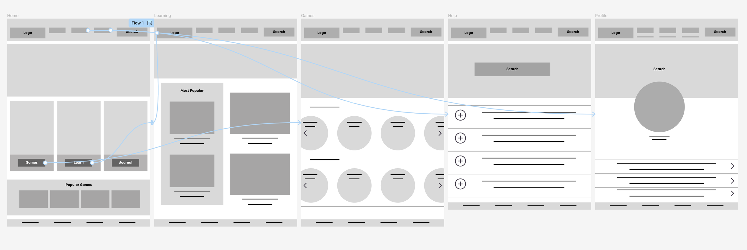
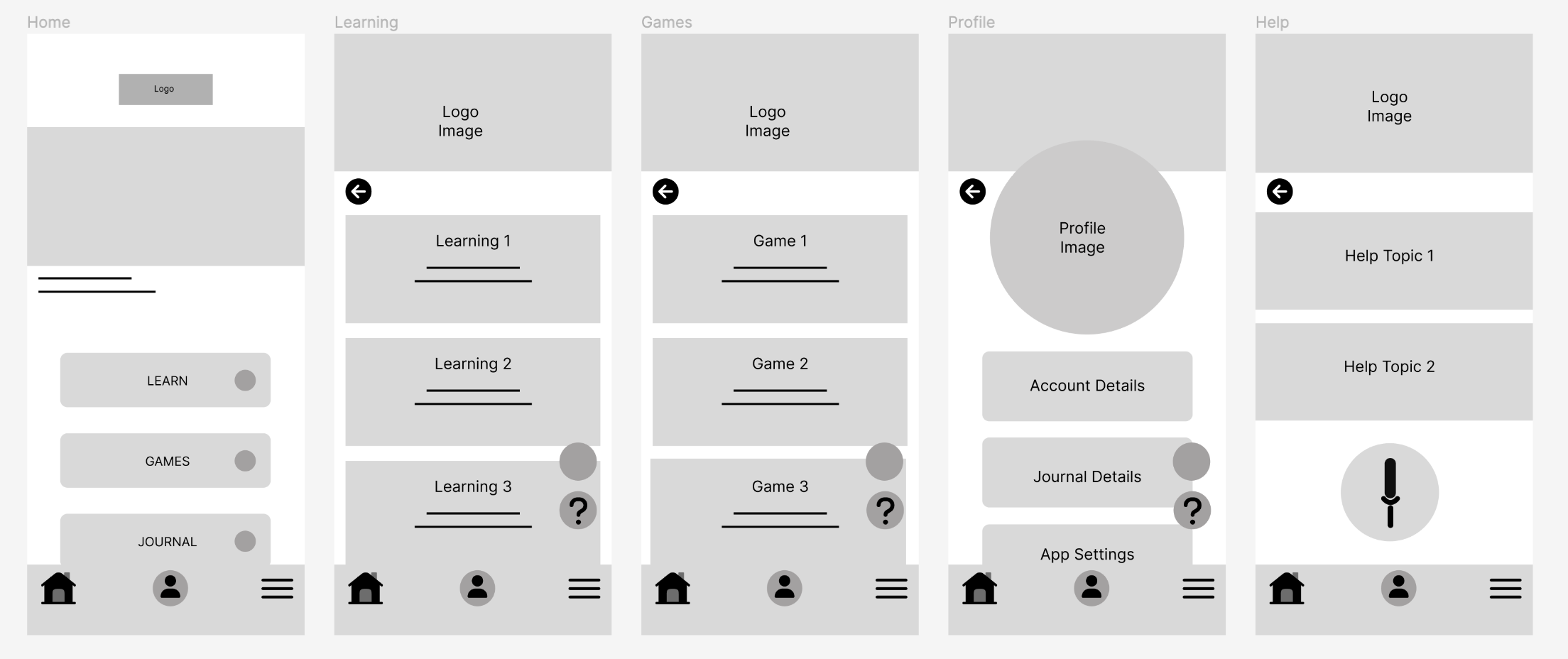
Wireframing (App & Responsive Website)
I kept the homepage and subsequent pages clean and simple without a lot of distractions and the choices are easy. Since the users will be young children, they need to be easily move through the app without frustration.
Digital Wireframing
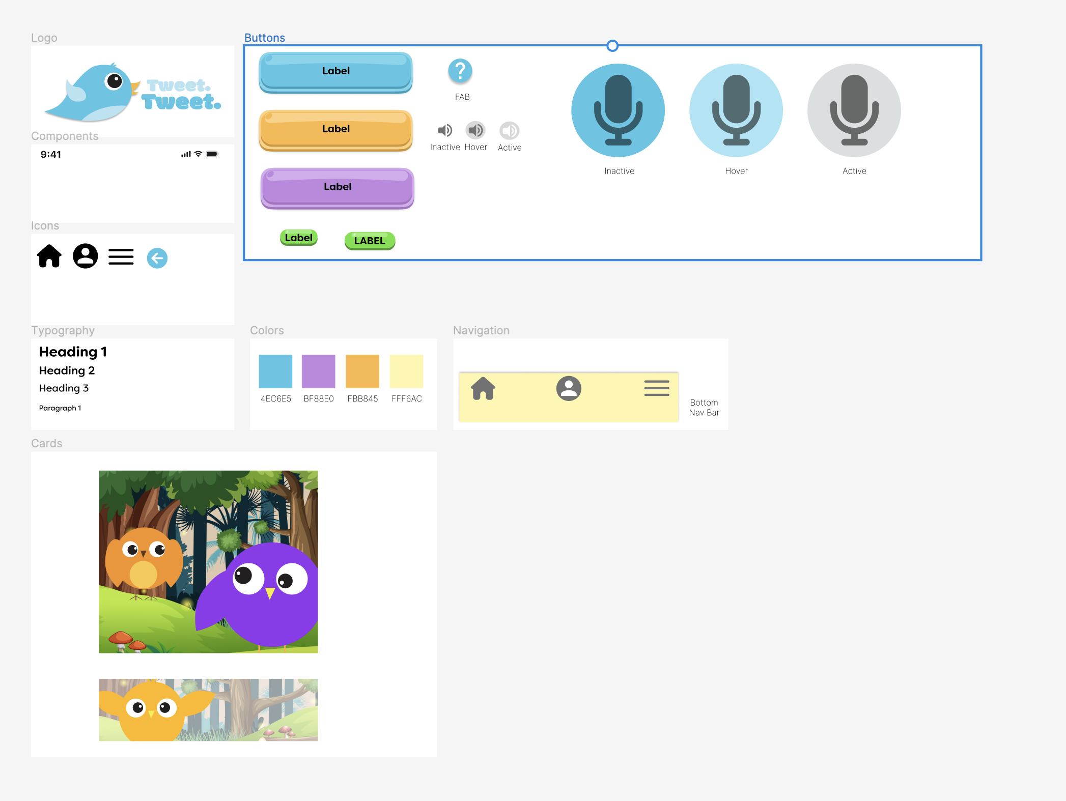
Simple buttons show the journey the user can take. Simple options to keep them from getting overwhelmed
Easy to read basic labels on the buttons for early readers
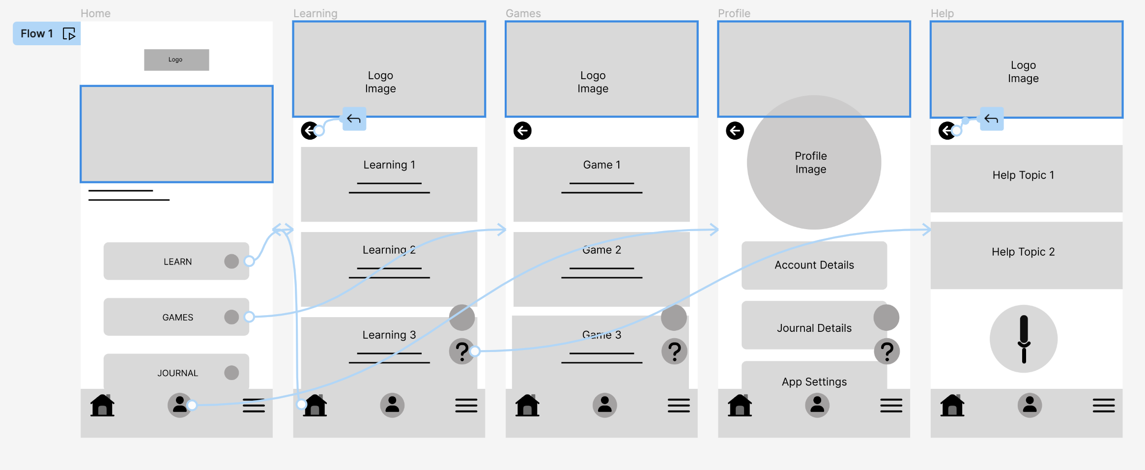
Lo-Fi Prototype
User Studies
Goal
Determine if users can complete core tasks in the Tweet Tweet app. Are there any issues or frustrations that arise in the process.
Research Questions
Are there parts of the app where they get stuck?
Do users think the app is easy or difficult to use?
Are there additional features that should be added?
What can be learned about the steps taken to complete tasks?
Participants
3 males and 2 females between the ages of 7-12
All studies were moderated
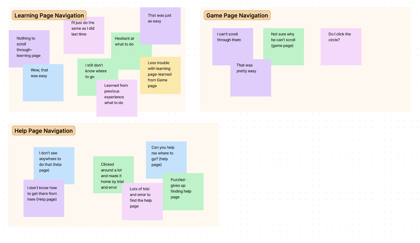
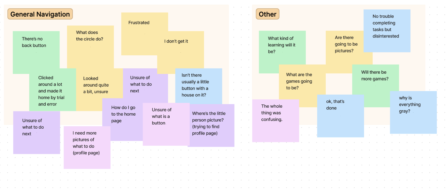
Affinity Mapping
Insights:
Users were confused as to what to do on the home page.
Users had trouble with navigation in general, moving forward and backward in pages.
Users had trouble locating the profile page.
Revised Wireframes
After conducting the user studies, the wireframes/lo-fi prototype were edited with the insights in mind.
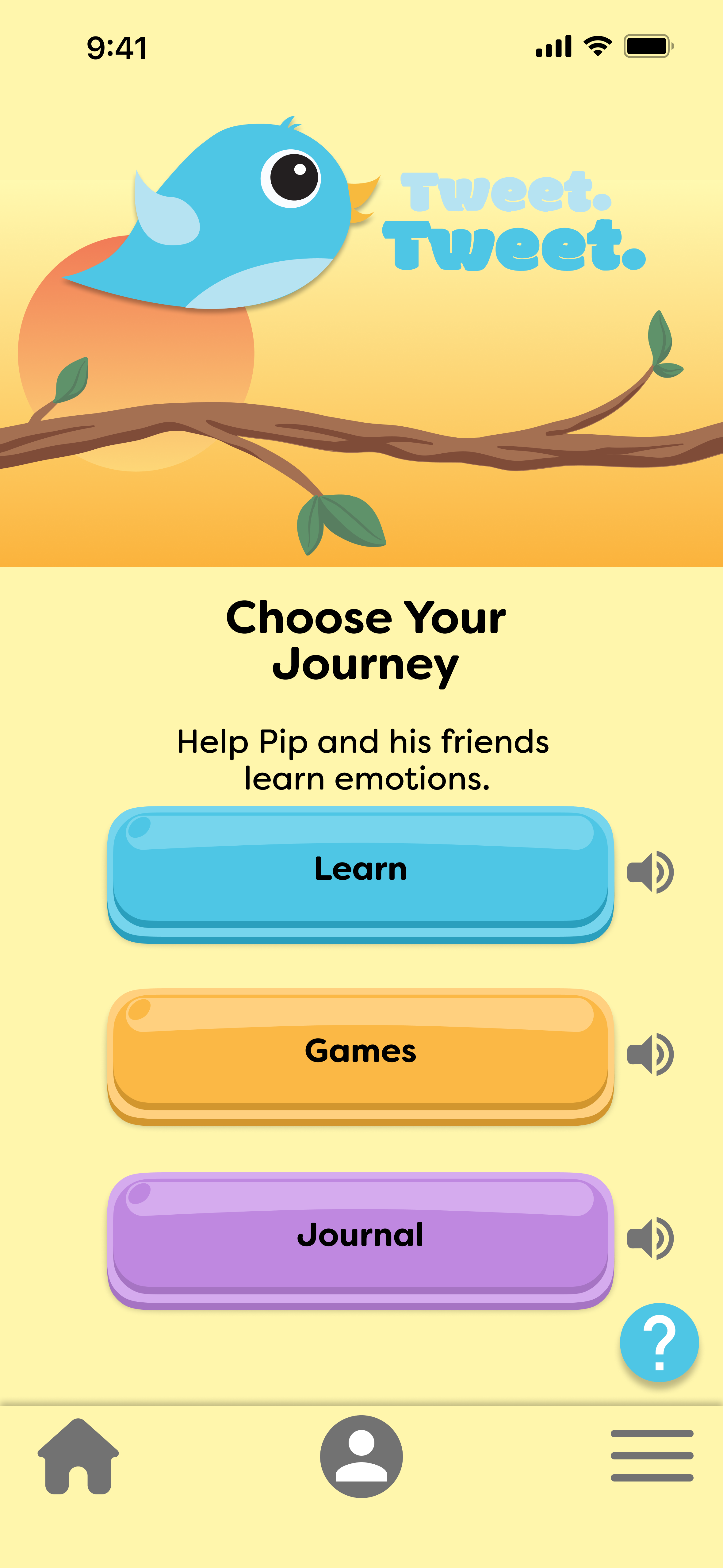
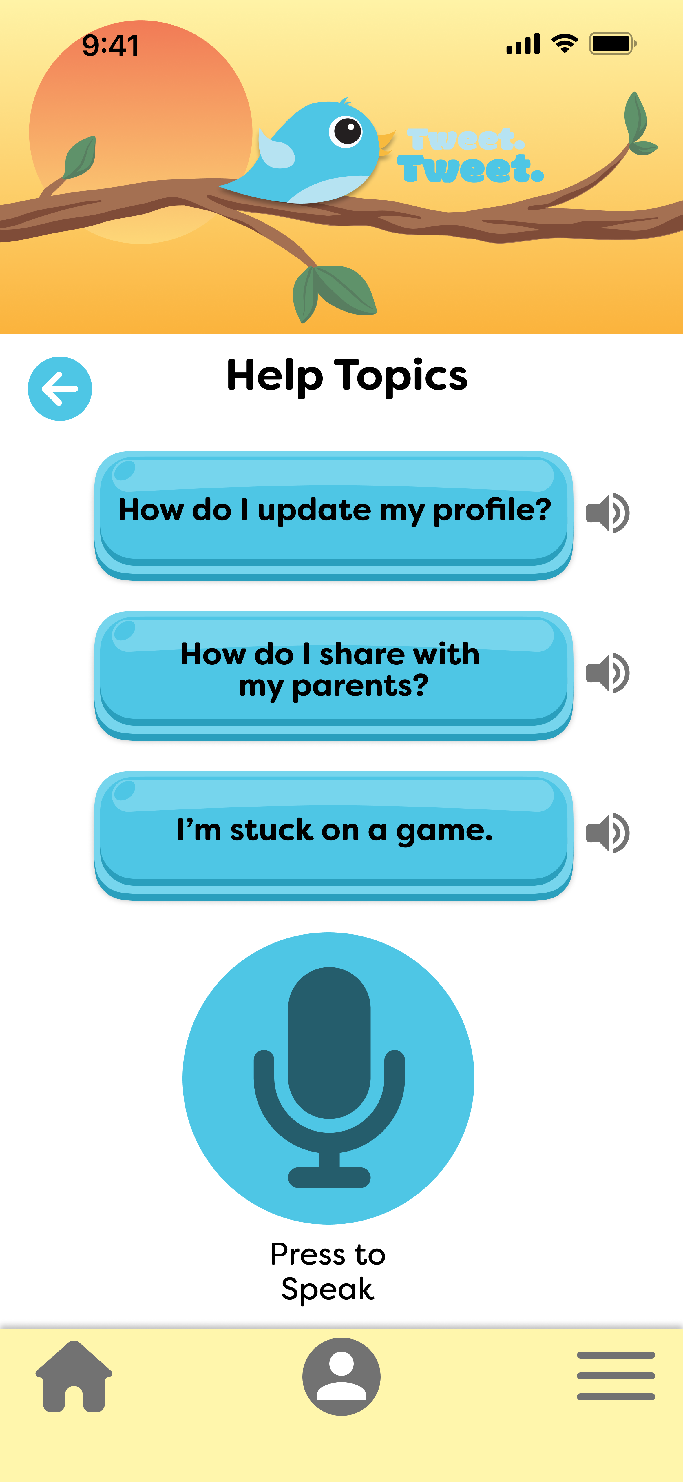
Final Designs
Accessibility Considerations:
Knowing that not all of the users would be proficient readers I added in the option have any text spoken to them by pressing the talk button
I kept all of the text short to aid with beginning readers
I created an option on the Help page for a question to be asked via the talk button for young users who aren’t proficient at typing
Final Thoughts:
In this study, I strived to make a clean and efficient design that users would find easy and quick to navigate. By conducting research I gained valuable insights into what users really want.
What I learned:
I gained valuable knowledge throughout this project. From learning how to base my designs on the user to going back and going through the ideation process repeatedly until the end product is completely user-based. I also learned that my first ideas don’t always solve the problem that sometimes taking a second look and sampling more users will create a more well-rounded design.


