Google UX Design Challenge: Responsive Website
Challenge
Design a responsive website for the same camping store used to build an app.
Solution
A responsive website for GoCamp that is simple and user friendly and cuts through the clutter.
Research
To conduct my research and understand the user I relied on user surveys consisting of adults 20-40 years old, both college students, young professionals as well as mid-career professionals. Most of them had families or siblings they lived with. They all expressed problems with finding time for doing things that they loved with their busy work schedule as well as some limitations based on language barriers and disabilities.
User Pain Points
Language Disabilities
Some of the users are not native English speakers or have disabilities reading or understanding text
Busy Schedules
The users are busy with either college or balancing work life with parenting/family life with their personal hobbies.
Budgets
Keeping to a reasonable budget.
User Personas
Amber is a single recent college grad who started her first teaching job at an elementary school. Her job keeps her busy and she also has limited eyesight so is often frustrated with websites and apps that have small type and images. She wants to take up an outdoor hobby but doesn’t know where to begin.
Rick is a single parent sharing custody of his teenage son. He’s a firefighter balancing a changing schedule while taking care of his son. He likes to spend time outdoors with his son, while also being budget and health conscious.
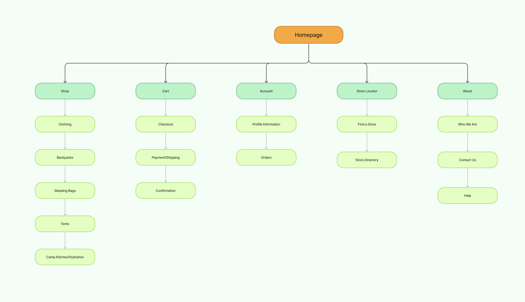
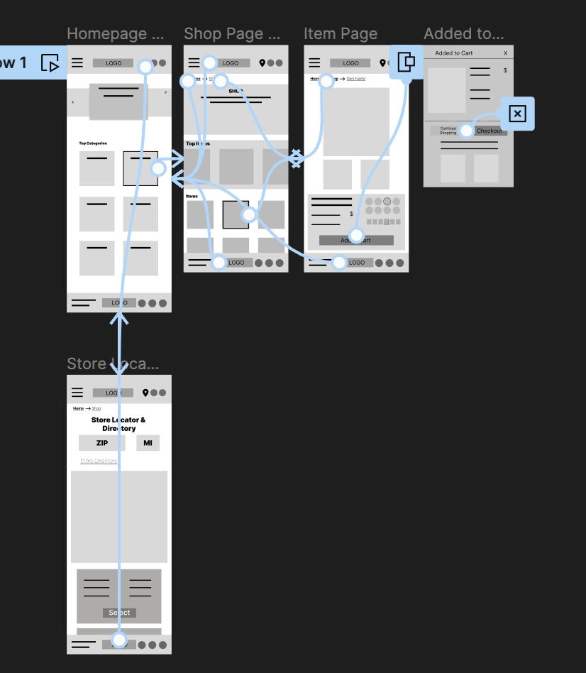
Site Map
I created a sitemap with the user in mind, keeping the user flow simple and easy to follow.
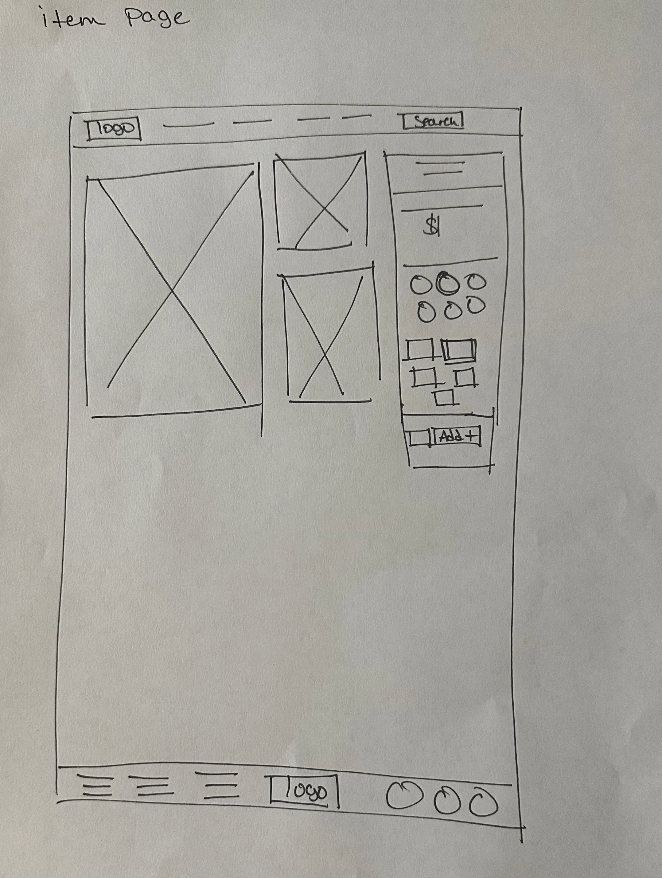
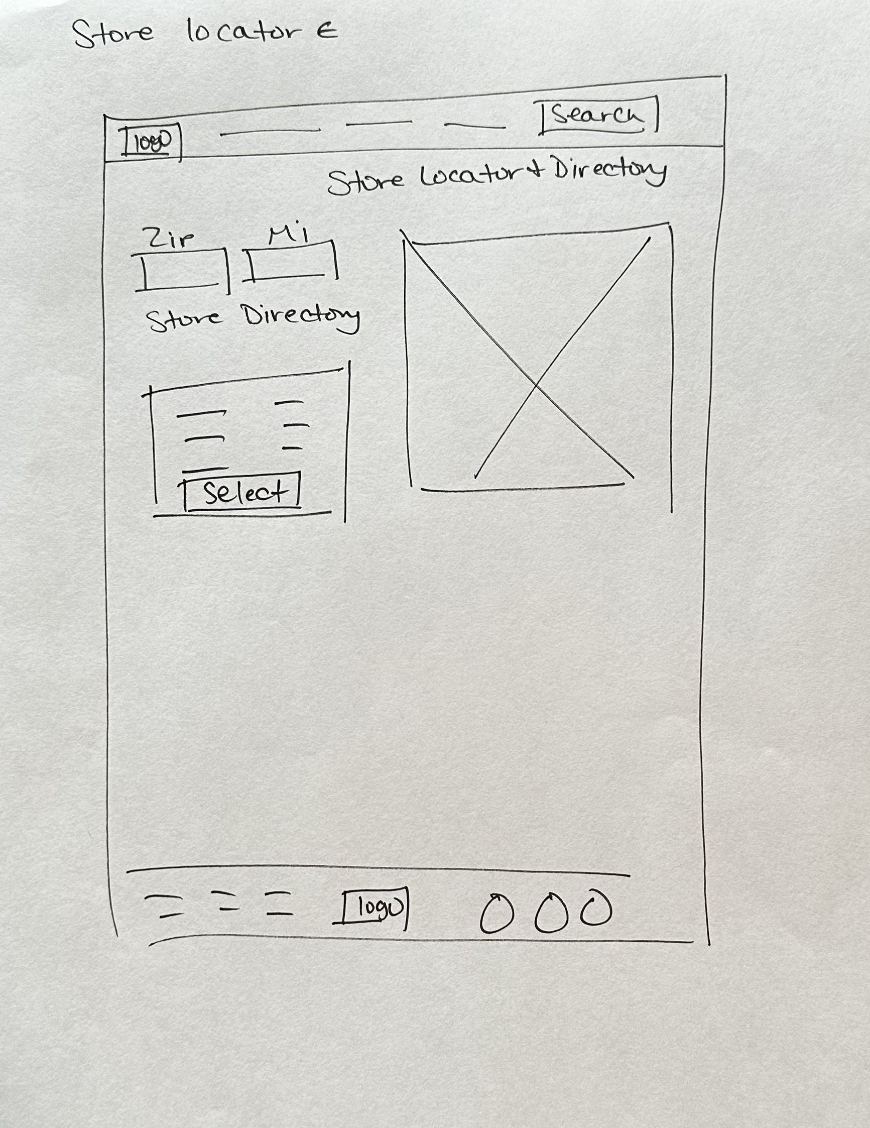
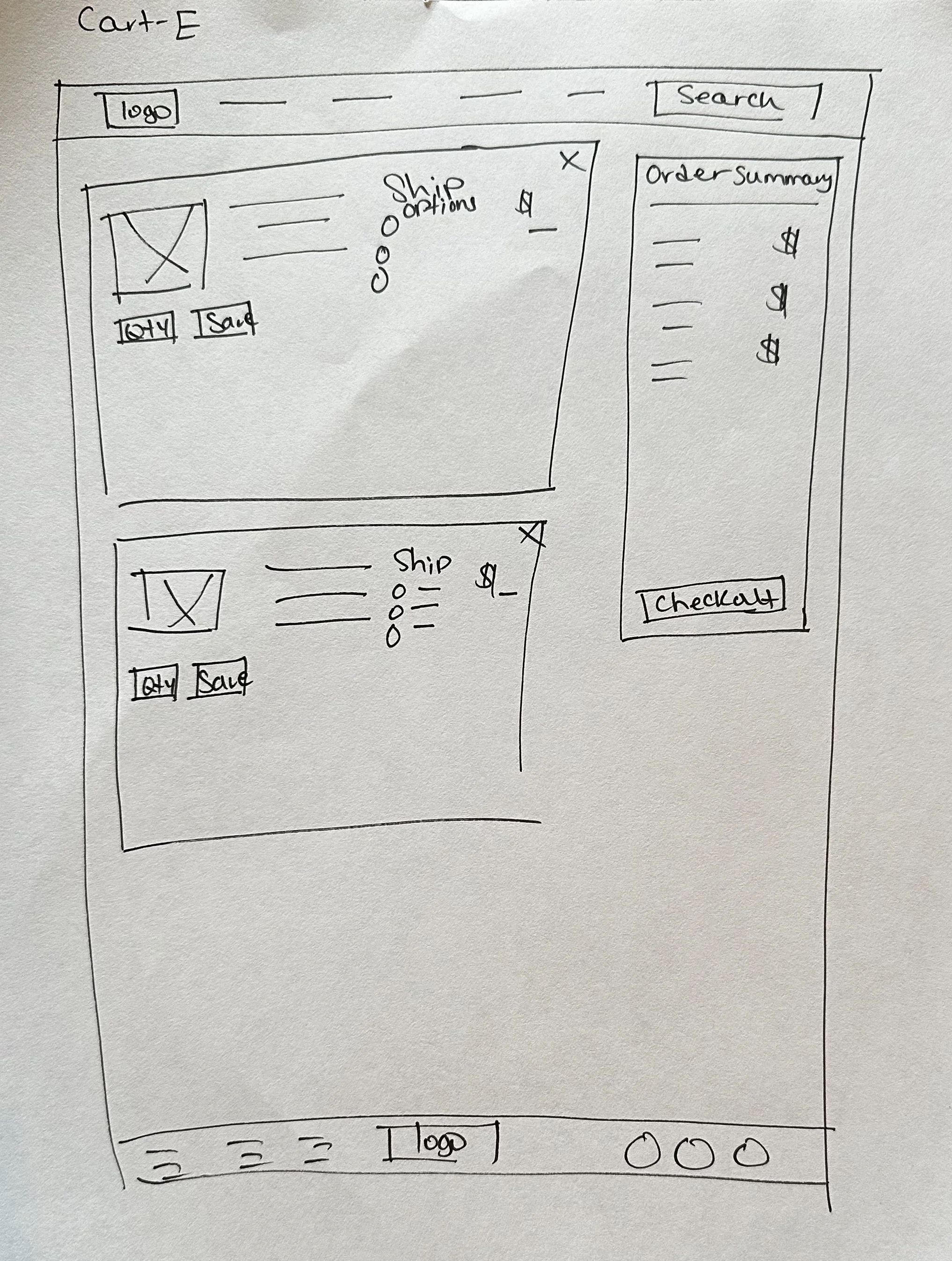
Wireframing
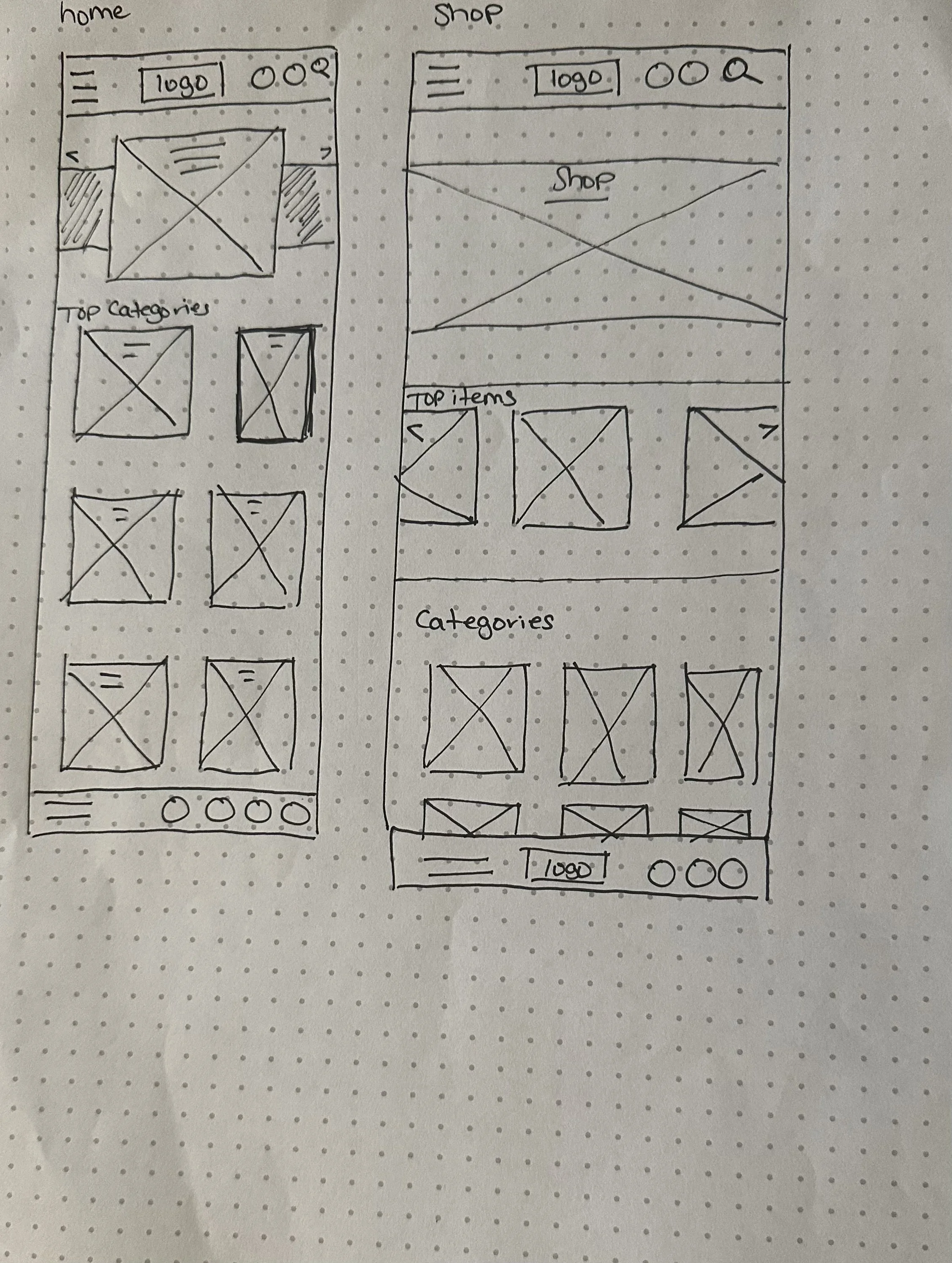
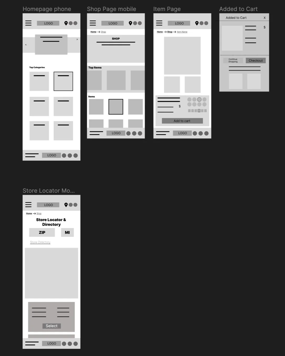
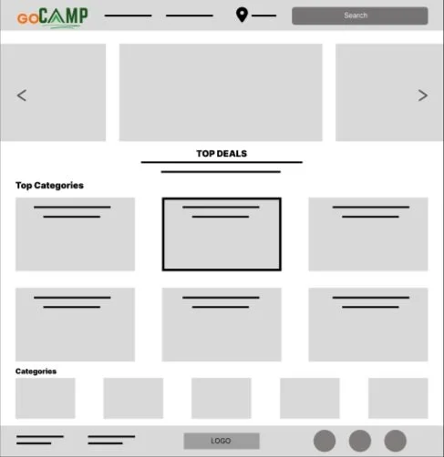
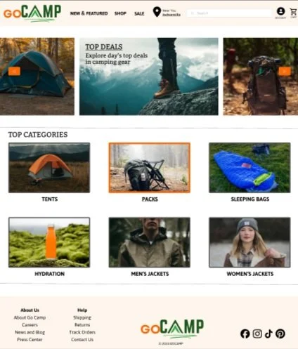
I wanted to keep the homepage subsequent clean and simple without a lot of distractions. The user can easily see what they need and can purchase it quickly. I also creative responsive screens so it can be used across platforms.
Digital Wireframing
I added a carousel of images to the home page that show the latest deals on products so users can see items that fit their budget
The images in the top categories have short titles that will take the user directly to the item page
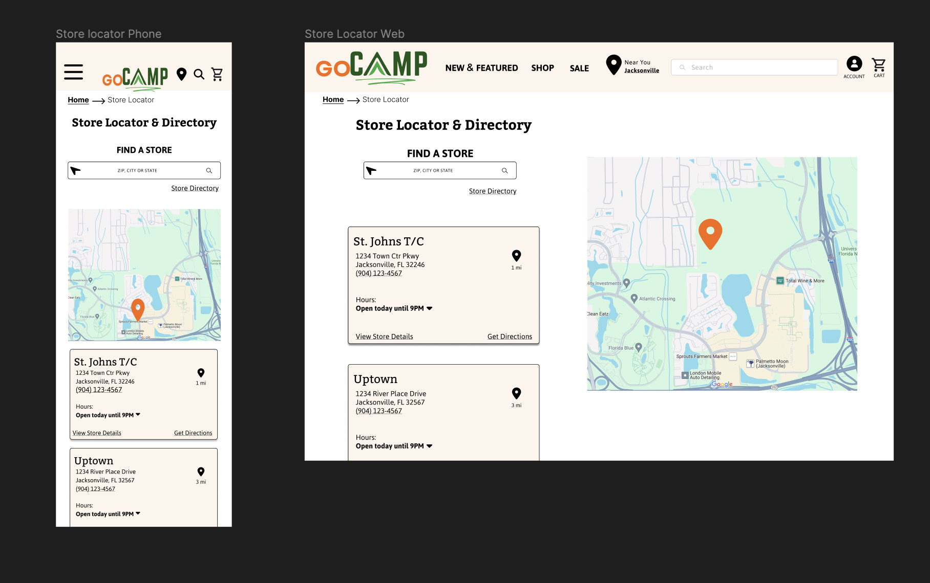
Responsive
Lo-Fidelity Prototype
I created low-fidelity prototypes to test functionality of all aspects of the responsive website before moving on to the final design.
User Studies
A usability study was conducted on five people ranging in age from 10-41.
Users were overwhelmed by the amount of images on the home page. Users need to feel less overwhelmed
Users found it difficult to read the category titles when they were over the images. Users need a more clear way to find what they need.
Users were confused by the multiple headers and categories. The home page hierarchy needs to be clearer.
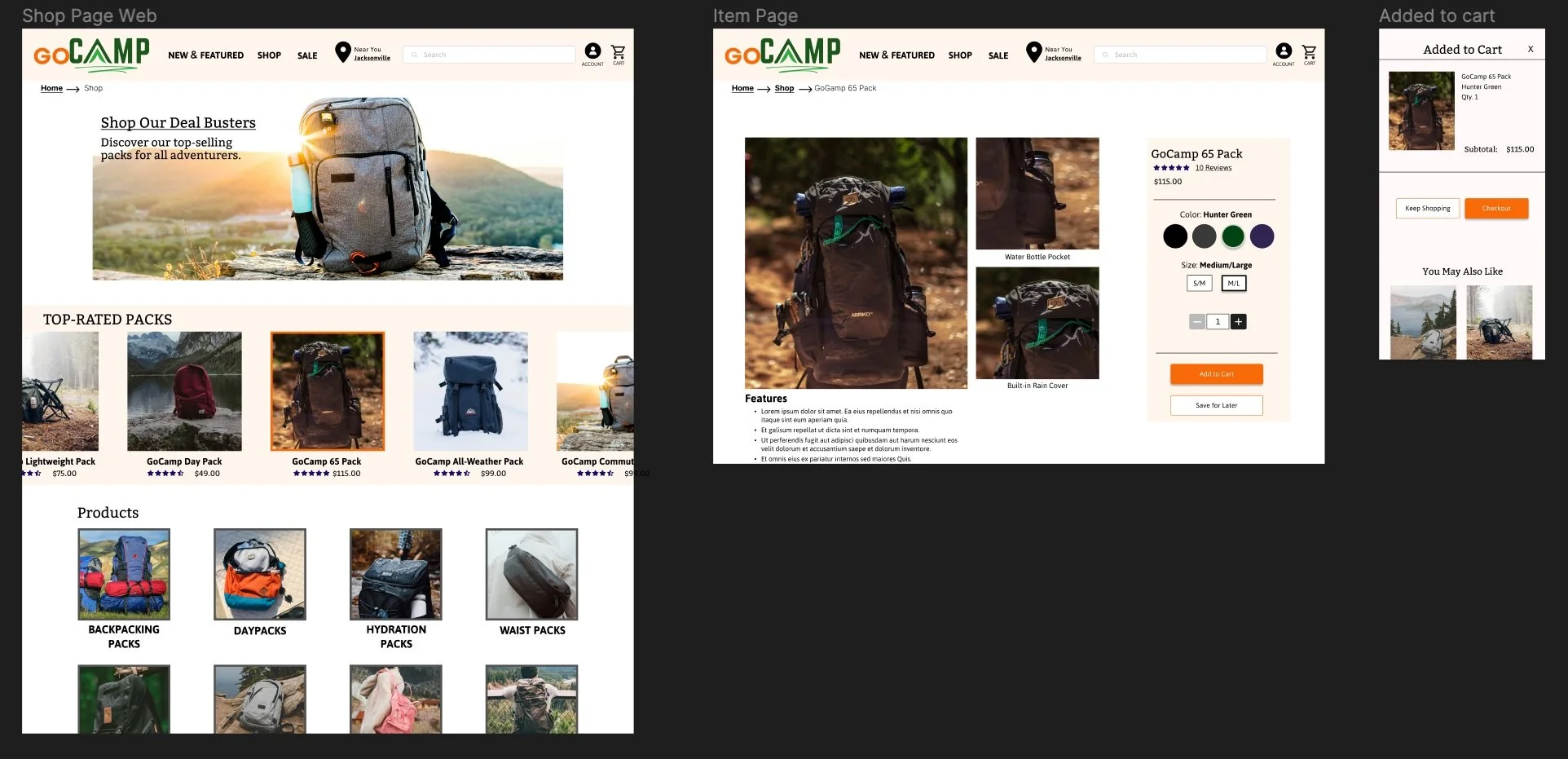
Hi-Fi Mockups
Key Takeaways
In this study, I strived to make a clean and efficient design that users would find easy and quick to navigate. By conducting research I gained valuable insights into what users really want.
I also gained valuable knowledge throughout this project. From learning how to base my designs on the user to going back and going through the ideation process repeatedly until the end product is completely user-based. I also learned that my first ideas don’t always solve the problem that sometimes taking a second look and sampling more users will create a more well-rounded design.

