Google UX Design Challenge:
Build an App
Challenge
Design an app for a camping supply store to advertise and sell its products.
Solution
An app for GoCamp designed for the busy adventurer in mind, to get the basics needed so they can spend more time doing what they love.
Research
User Personas
Amber
Amber is a single recent college grad who started her first teaching job at an elementary school. Her job keeps her busy and she also has limited eyesight so is often frustrated with websites and apps that have small type and images. She wants to take up an outdoor hobby but doesn’t know where to begin.
“Teacher and explorer at heart.”
Rick
Rick is a single parent sharing custody of his teenage son. He’s a firefighter balancing a changing schedule while taking care of his son. He likes to spend time outdoors with his son, while also being budget and health conscious.
“Living life to the fullest.”
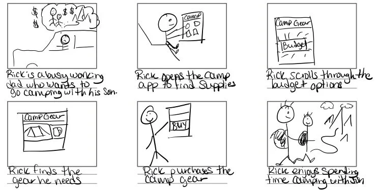
Storyboarding
Big Picture
An app that allows users to purchase camping equipment easily while being on a budget.
Close Up
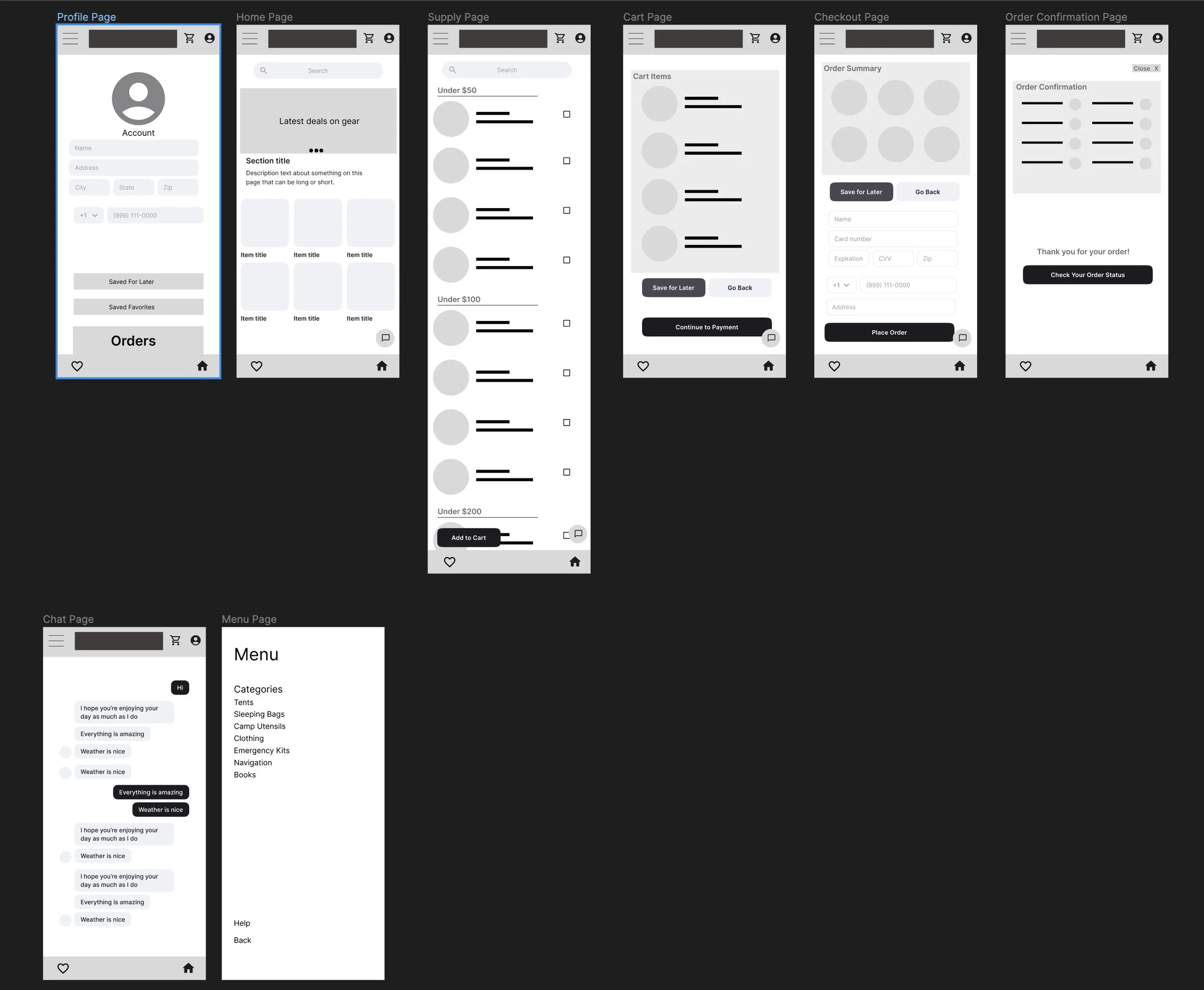
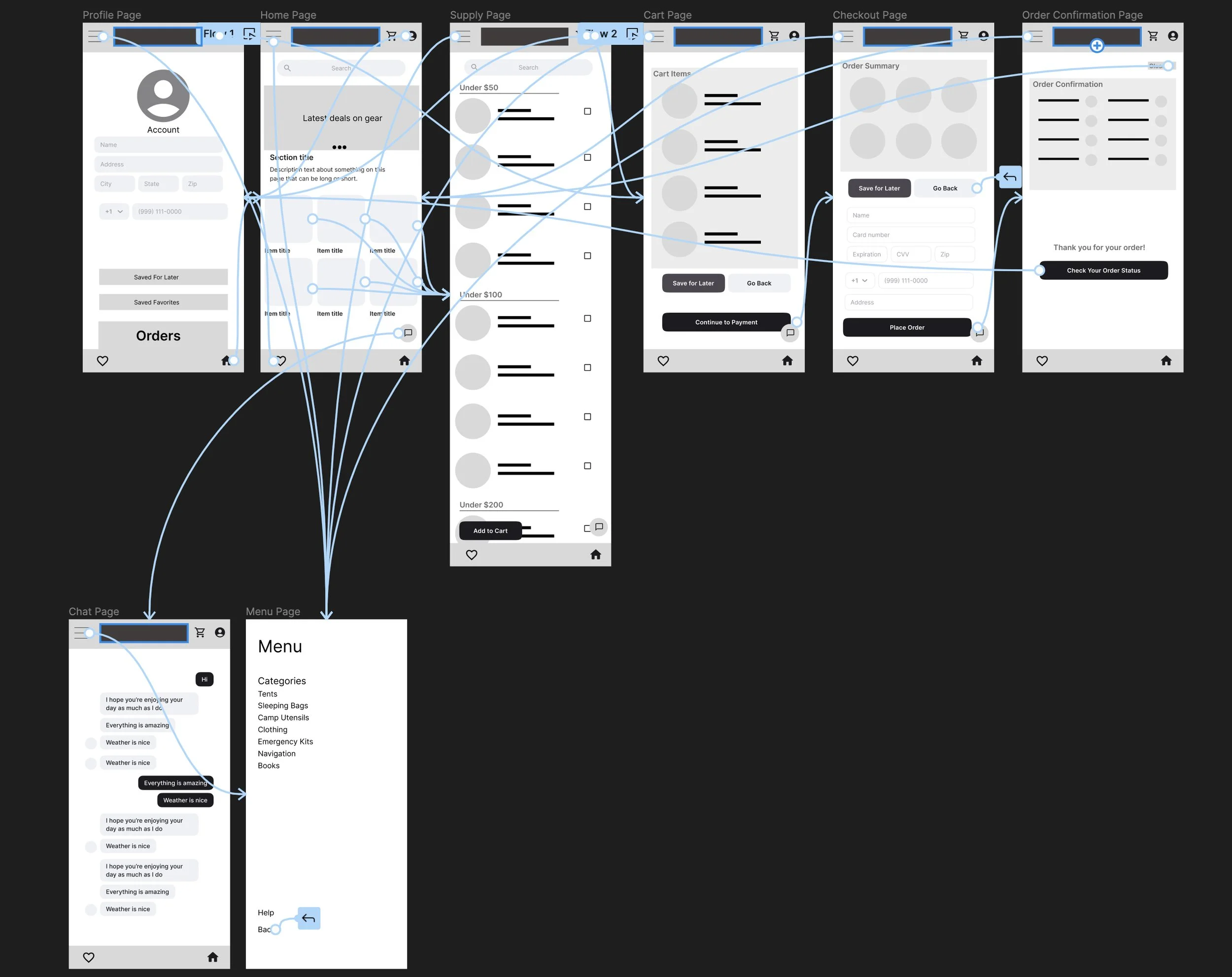
Wireframing
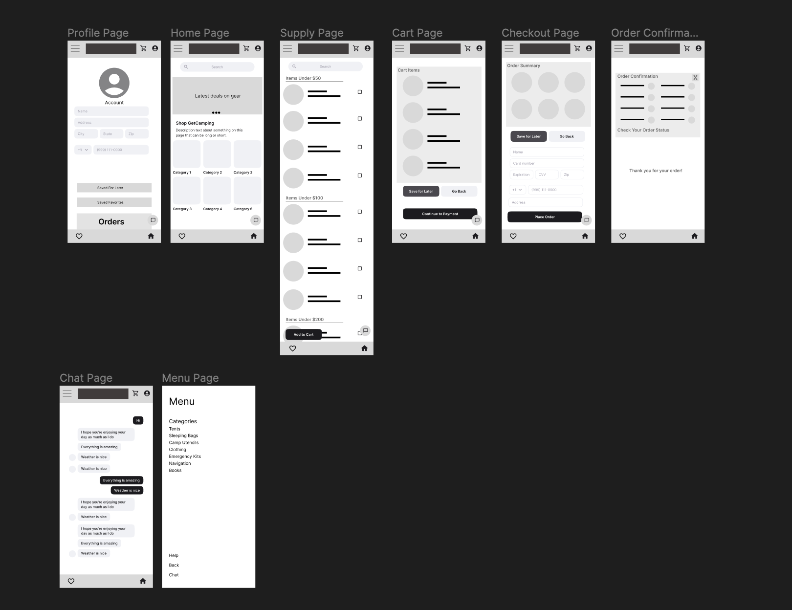
While wireframing I kept my users in mind that wanted an easy and quick way to purchase the gear they needed to go camping. The design needed to be simplistic and not overly complicated.
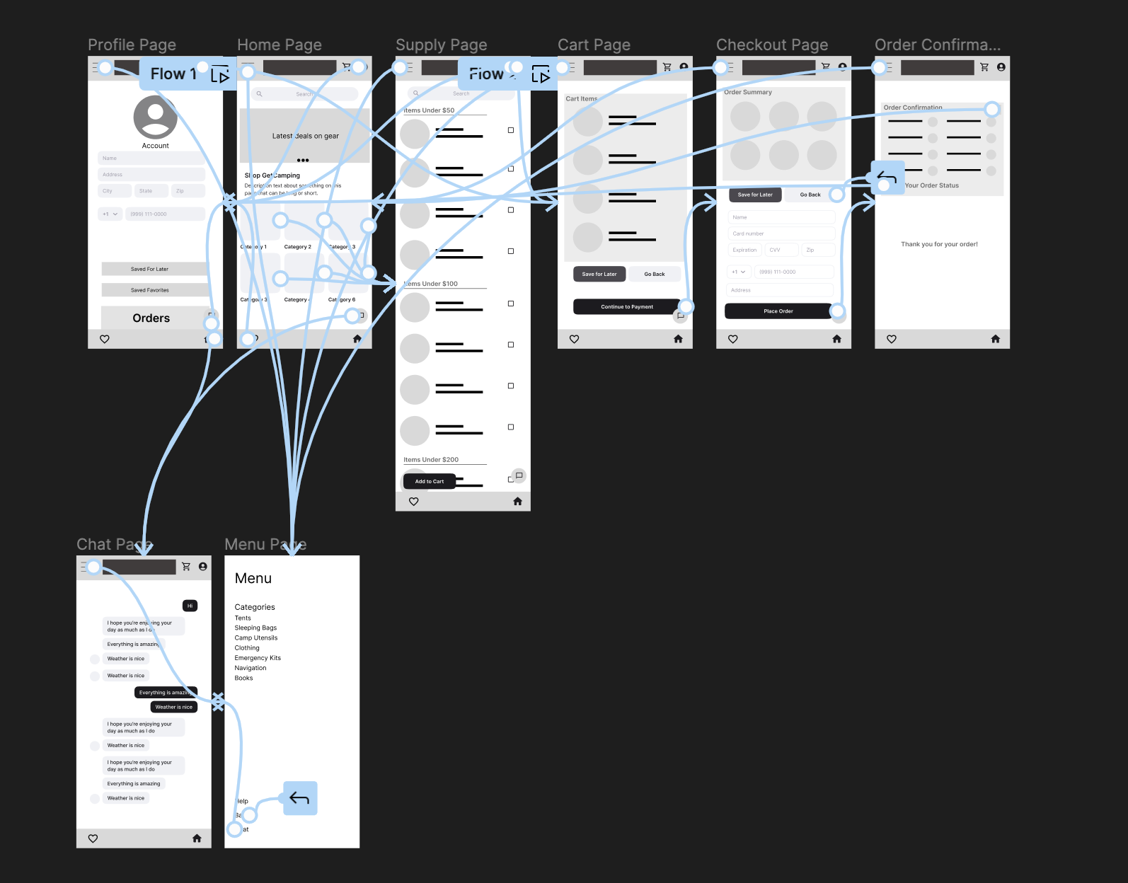
Lo-Fi Prototype
User Studies
Goal
Determine if users can complete core tasks in the camping store app and observe if there any issues or frustrations arise in the process.
Research Questions
How long does it take to purchase the items needed?
Are there parts of the app where they get stuck?
Do users think the app is easy or difficult to use?
Are there additional features that should be added?
What can be learned about the steps taken to purchase items?
Participants
5 participants between the ages of 10-41
3 Males and 2 Females2 Studies were moderated and 3 studies were unmoderated
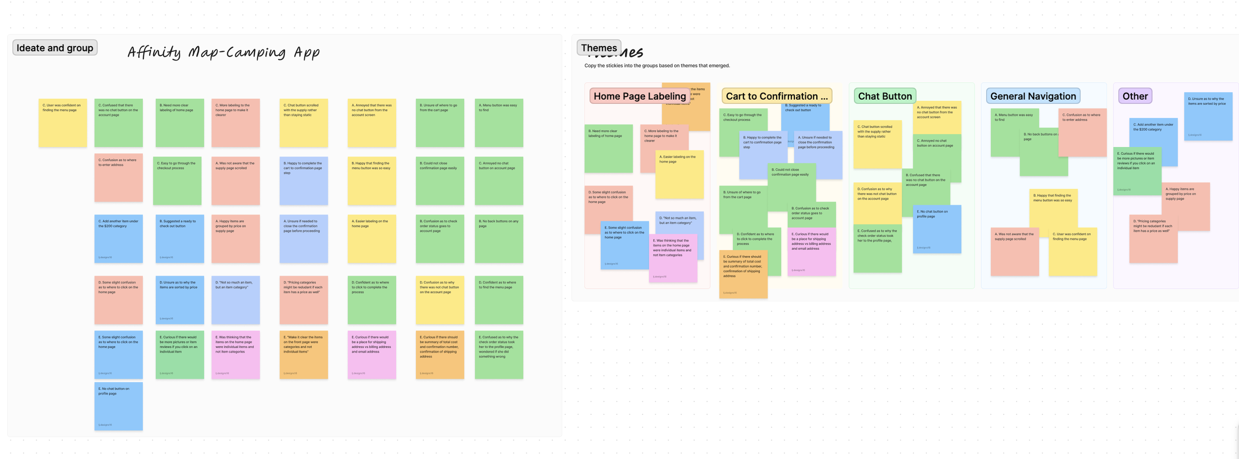
Affinity Mapping
Insights:
All users need more clear labeling on the homepage
The chat button needs to be more clearly marked and on each page
Users need a more clear way to navigate away from the confirmation page
The menu is appropriately marked and easy to find.
The check order status button needs to be revised or placed elsewhere.
Revised Wireframes
After conducting the user studies, the wireframes/lo-fi prototype were edited with the insights in mind.
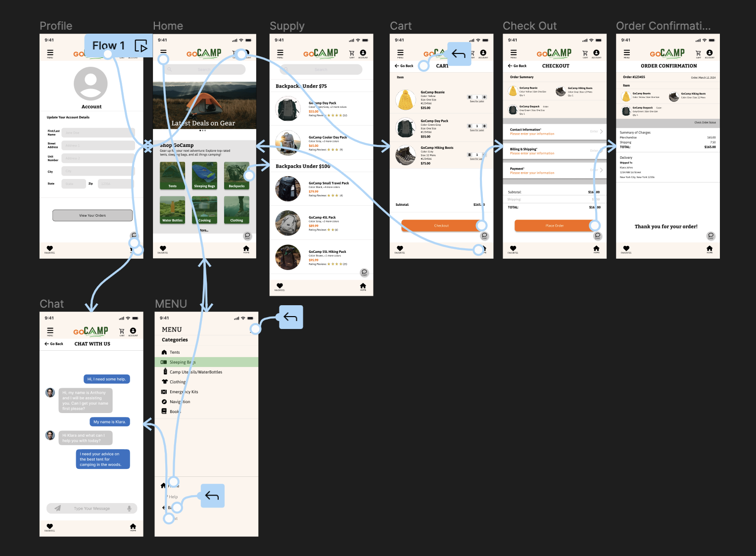
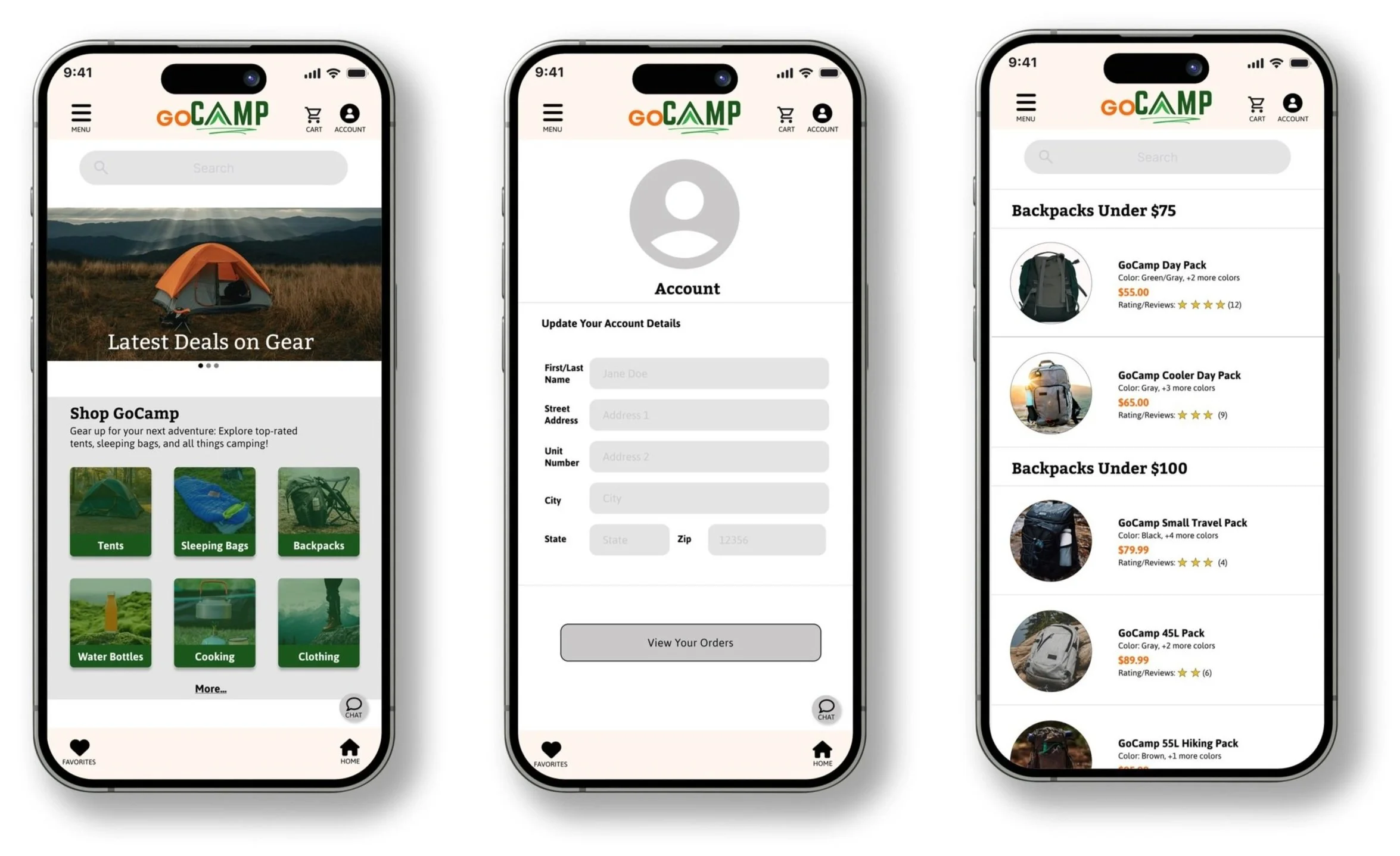
Hi-Fi Mockups
Hi-Fi User Studies
Goal
Determine if users can complete core tasks in the camping store app and observe if there any issues or frustrations arise in the process.
Research Questions
Are there parts of the app where they get stuck?
Do users think the app is easy or difficult to use?
Are there additional features that should be added?
Participants
5 participants between the ages of 10-41
3 Males and 2 FemalesAll studies were moderated
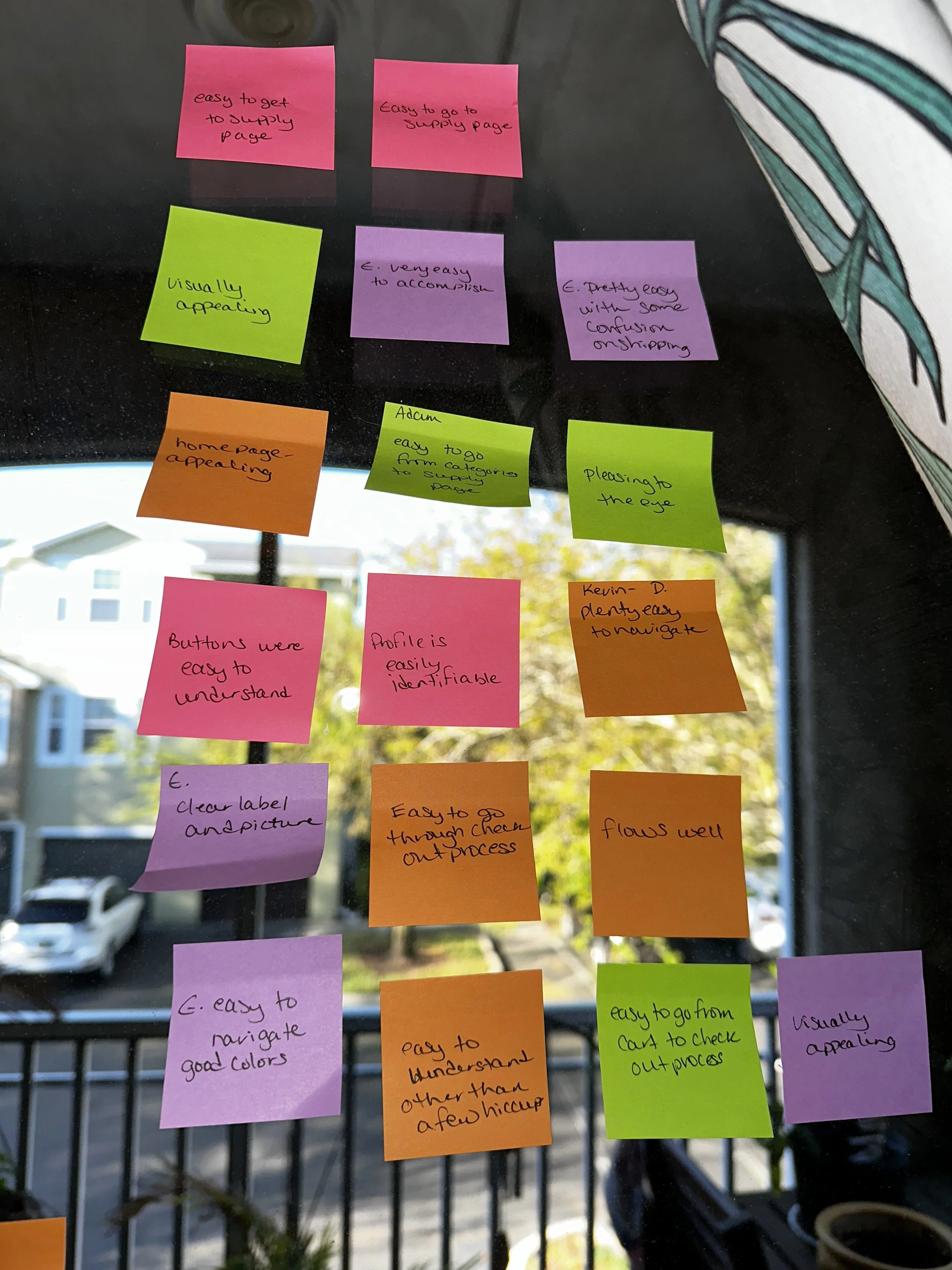
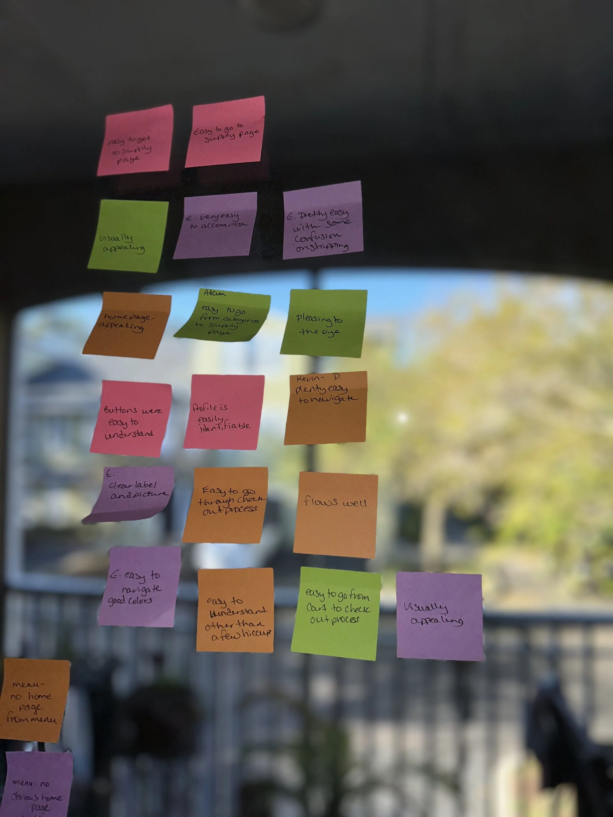
Hi-Fi Prototype Affinity Mapping
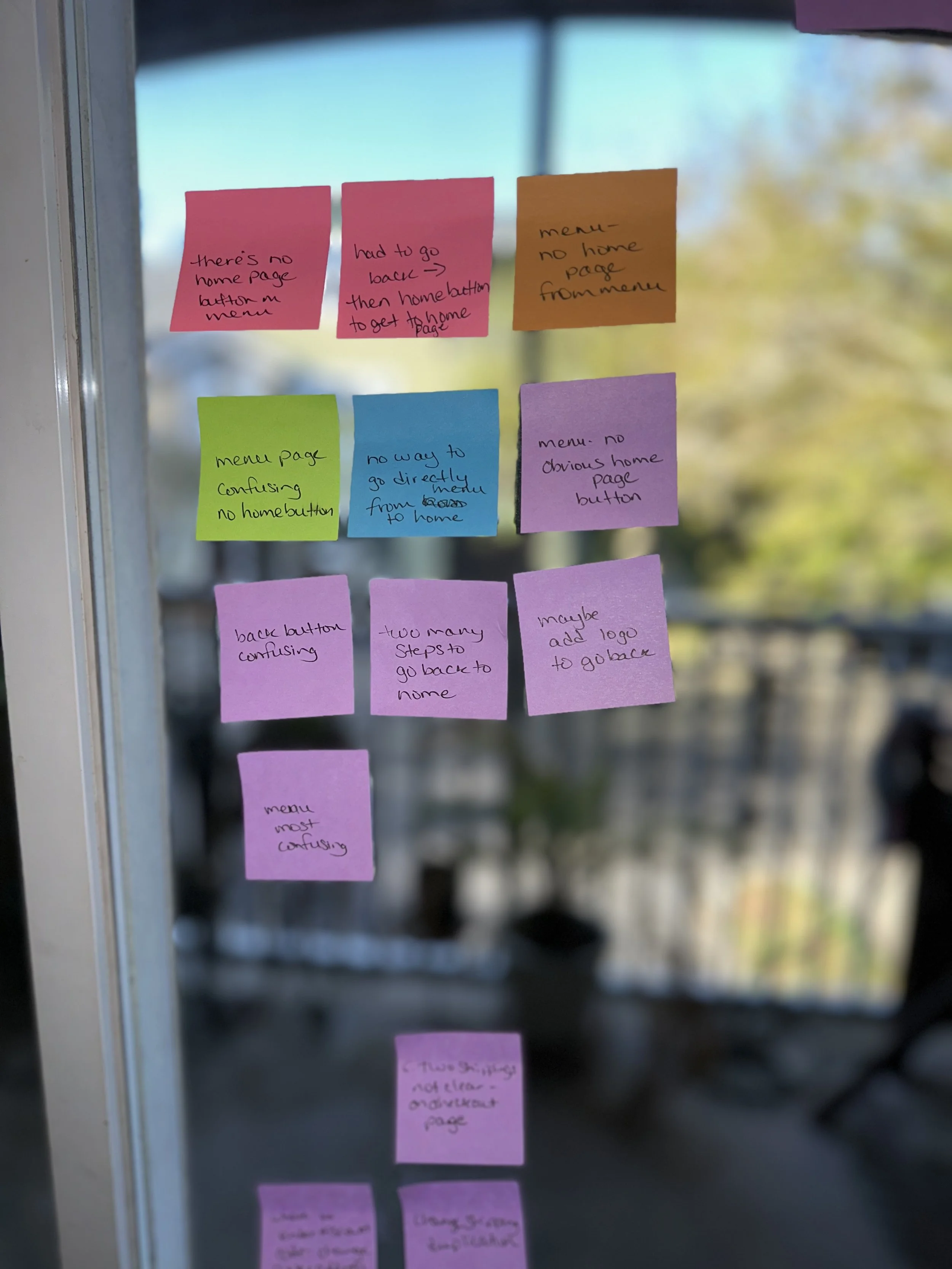
Insights:
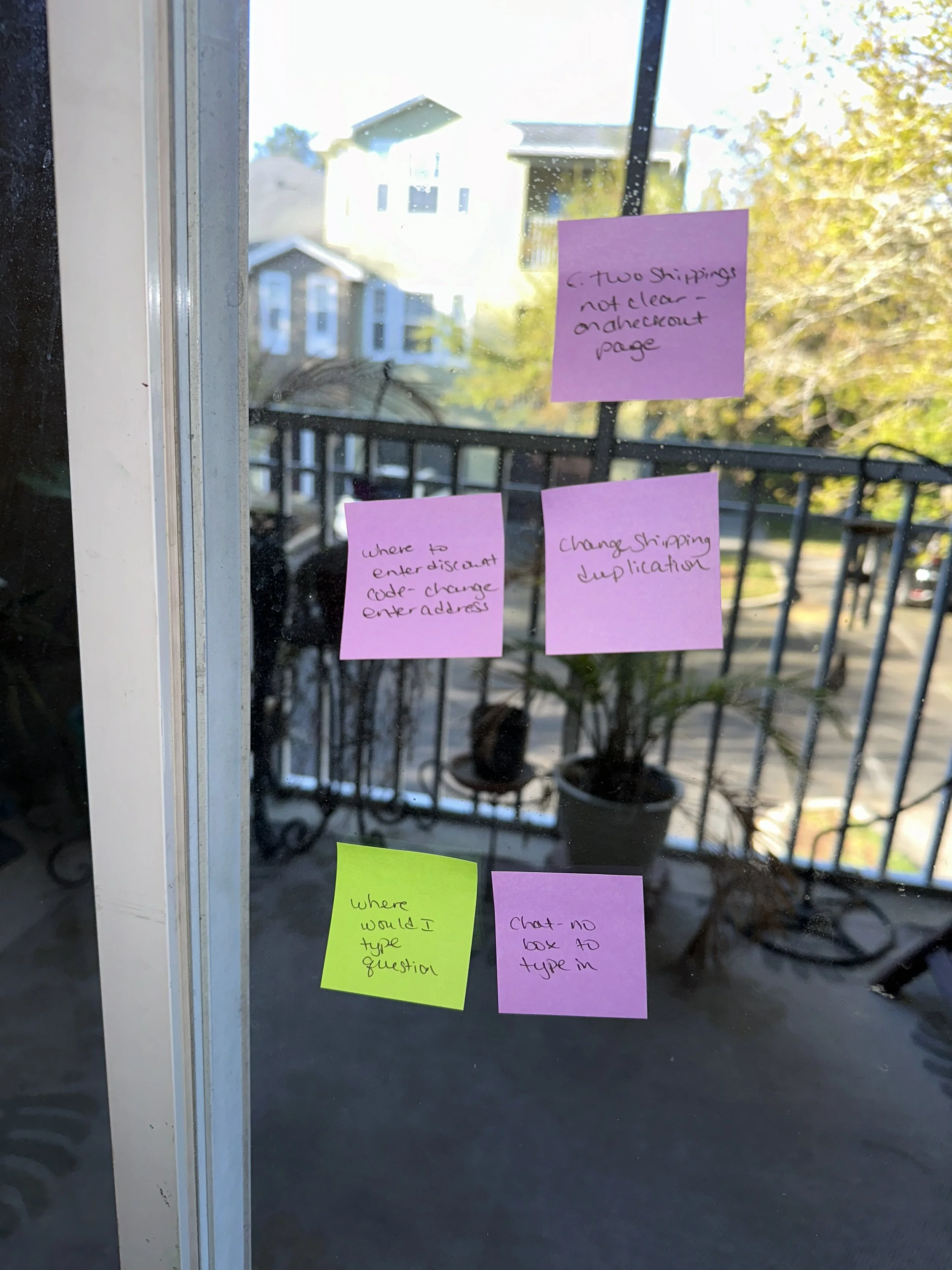
Users need a home button or more clearly labeled navigation to home page
The bottom nav bar needs to be edited to not be see-through
The shipping could be confusing to users and the duplicity should be checked
The app has a good user flow.
Users may find the chat page slightly confusing
Final Designs
Final Thoughts: GoCamp is an app that was designed with the users in mind that is an easy to navigate and enables the users to get what they need and get on with doing what they love.
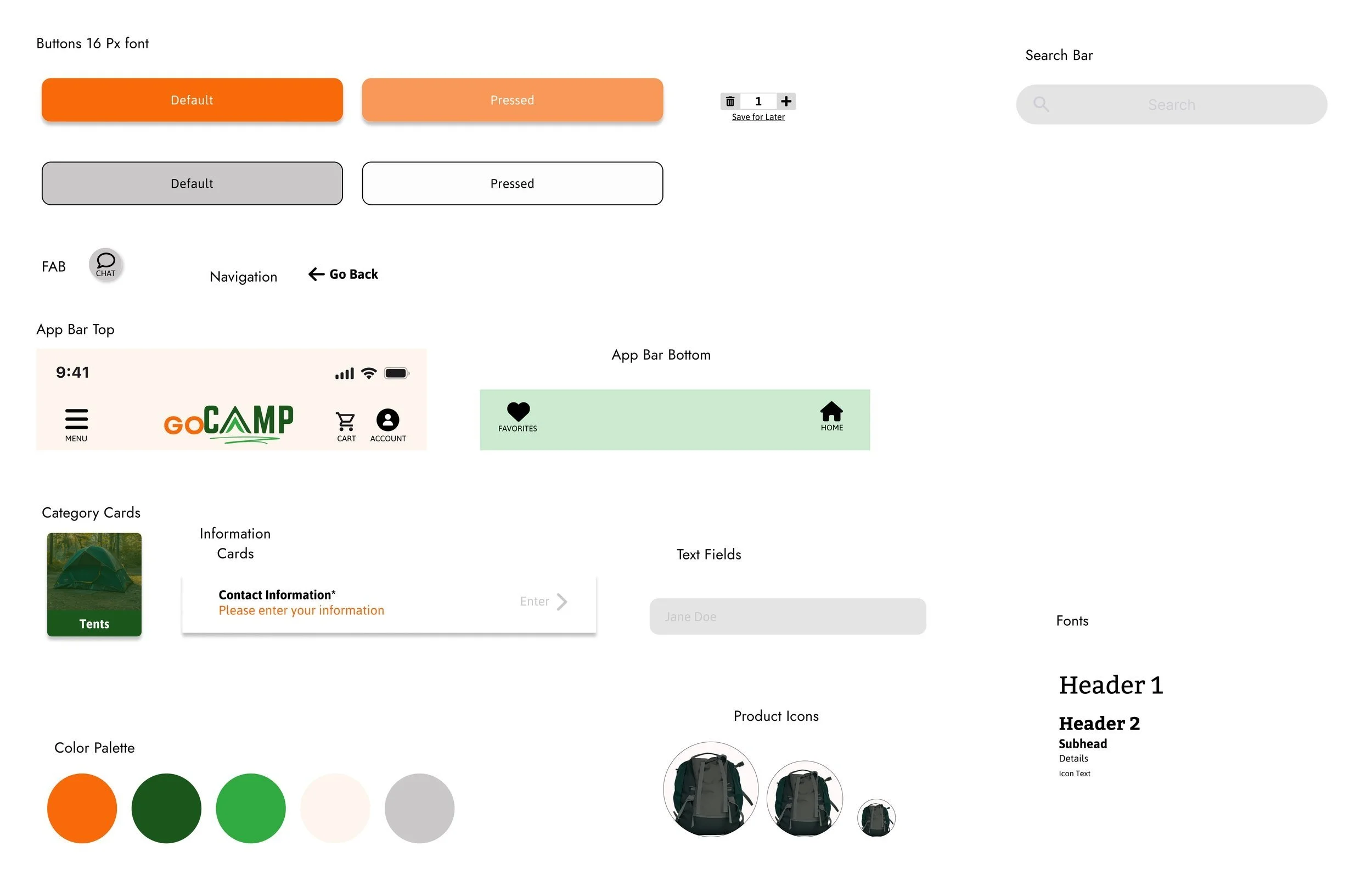
Sticker Sheet

